
Thursday, December 8, 2011
Yahtzee Game
Dove Soap

Glee Bracelet

Reese's Pieces Package

Monday, November 14, 2011
DVD Cover

Monday, November 7, 2011
Footloose Poster

Monday, October 31, 2011
Old Poster
 This is a poster that I found at my mom's work. I would classify this poster as Victorian. The way the woman is drawn and the organized layout reminds me of the Victorian pieces that we looked at in class. I am not really sure what this poster says because it is in a different language, but I would assume that the bigger words are the most important ones and they draw the reader in. I was attracted to this piece because it is so organized. I really like organized posters like this one.
Monday, October 24, 2011
Book Cover

This is a poster of a book cover that I saw while visiting my mom at her work. The function of this is to advertise the book and tell what it is about. I really like the way the designer made the man and the words overlap each other. It gives the picture a bit of depth. The title of the book is big and bold so it stands out. I think that anyone interested in volleyball would be drawn to this book because it says "Techniques, training, and tactics from the game's greatest player." I was attracted to this because of the way the words and pictures interact.
Monday, October 17, 2011
World's Fair Poster

Thursday, October 13, 2011
Wedding Program

This is the wedding program from my mom and dad's wedding. We found it while we were going through old things. My mom did the design, layout, and paste-up herself. She shot the photos using the stat camera at her work with the screens that they had for doing that. She had one of the typesetters at work set the type for her, then she shot it with the stat camera so that she could put it on clear film to use it as an overlay over the photos. Then the took the whole thing to a printer to get it printed. I really like the way the pictures are put behind the words. If there were no pictures, the program would be very boring. I also like the the type on the front. It is elegant and looks like handwriting. I really like this piece because of the way it was made. While my mom was describing the process to me, I found it very fascinating. This program was put together very well for not having a computer.


Book Cover

Party Invite

This is an invitation made for my aunt and uncle's wedding 26 years ago. This invitation was designed by my mom. It was press type, meaning the type had to be pressed on the page. The map and drawing was done by hand with a rapidograph pen. Once the design was complete, she xeroxed the page to make copies. I chose this design because I feel it is well made for being made without a computer. I like the type used because it is formal but fun. This invitation was made to advertise an engagement party. Even though this isn't very complex, I like the design because it was made so long ago and it didn't require a computer.
Monday, October 10, 2011
Apple Logo

New York Shirt

Monday, October 3, 2011
Marching Band Poster

Monday, September 26, 2011
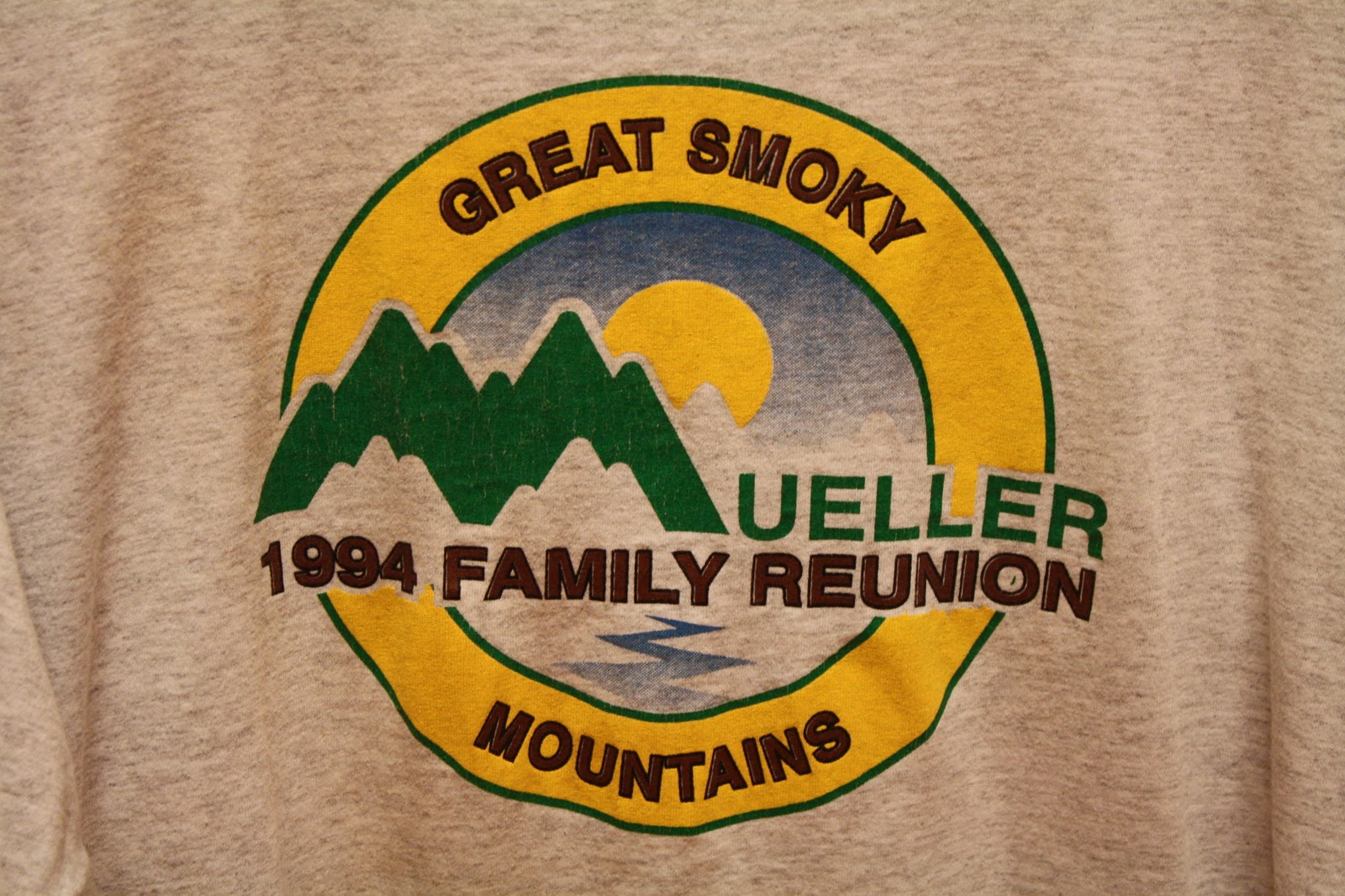
Mueller Reunion T-Shirt
Monday, September 19, 2011
The Odd Life of Timothy Green
 This is a poster I found hanging in the movie theater. I like the simplicity of it. It has two basic colors, green and white. The organic shapes of the plant coming out of the sock are reflected in the lettering of the title. The poster also says, "He's a force of nature." The "nature" part is reflected through the plant and the use of green throughout the poster. The function of the poster is to advertise and draw people in. The people will wonder what the movie is about, prompting them to go see the movie. I was attracted to the piece because it is so simple.
Sunday, September 11, 2011
Coca-Cola Sign

Monday, September 5, 2011
Broadway Program

 This first picture is the cover of a Broadway program I got from New York City this past summer. I really like this cover because it is so simple, yet it gets its point across. Its point being what the play is about. The picture of the main character stands out against the simplified background, showing people that he is the most important person. If the background was more complicated, people could get distracted from the main picture. The title also shows what the play is about. The title is so long that is describes the whole play. The designer made the two words "How" and "Succeed" bigger than all the rest because they are the most important. From the "How" people can guess the play is like a "How to" book. From the "Succeed" people can guess that the man on the cover wants to succeed in something, that being business. Just from the cover of this program, people can guess what the play is about. The second image is from the inside of the Broadway program. It is also simple, but not too simple. I like how the designer took elements from the stage and put them into the program. The blue hexagons are repeated throughout the whole program. In the picture from the play, you can see the hexagon shapes in the stage background. The designer took a simple shape from the stage and repeated it several times to get a simple, yet effective design.
Subscribe to:
Posts (Atom)