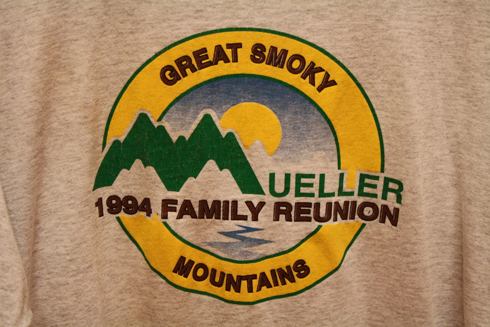
Monday, September 26, 2011
Mueller Reunion T-Shirt
Monday, September 19, 2011
The Odd Life of Timothy Green
 This is a poster I found hanging in the movie theater. I like the simplicity of it. It has two basic colors, green and white. The organic shapes of the plant coming out of the sock are reflected in the lettering of the title. The poster also says, "He's a force of nature." The "nature" part is reflected through the plant and the use of green throughout the poster. The function of the poster is to advertise and draw people in. The people will wonder what the movie is about, prompting them to go see the movie. I was attracted to the piece because it is so simple.
Sunday, September 11, 2011
Coca-Cola Sign

Monday, September 5, 2011
Broadway Program

 This first picture is the cover of a Broadway program I got from New York City this past summer. I really like this cover because it is so simple, yet it gets its point across. Its point being what the play is about. The picture of the main character stands out against the simplified background, showing people that he is the most important person. If the background was more complicated, people could get distracted from the main picture. The title also shows what the play is about. The title is so long that is describes the whole play. The designer made the two words "How" and "Succeed" bigger than all the rest because they are the most important. From the "How" people can guess the play is like a "How to" book. From the "Succeed" people can guess that the man on the cover wants to succeed in something, that being business. Just from the cover of this program, people can guess what the play is about. The second image is from the inside of the Broadway program. It is also simple, but not too simple. I like how the designer took elements from the stage and put them into the program. The blue hexagons are repeated throughout the whole program. In the picture from the play, you can see the hexagon shapes in the stage background. The designer took a simple shape from the stage and repeated it several times to get a simple, yet effective design.
Subscribe to:
Comments (Atom)